

Walk into many healthcare buildings and colour tends to appear in one of two ways: either there is very little of it, or there is so much that the space becomes visually confusing.
Neither approach is particularly thoughtful.
Colour in healthcare should not be treated as a decorative layer applied once the planning and technical decisions have been made. Used carefully, it can make a building feel more welcoming, help people recognise important destinations, improve visual clarity and give different spaces an appropriate character.
However, colour cannot do this work alone. It needs to be considered alongside natural and artificial light, materials, artwork, signage, acoustics, furniture and the spatial layout of the building.
The most useful question is not, What colour makes people feel calm? It is:
What does this particular space need to help people understand, feel and do?
Why did healthcare become associated with white?
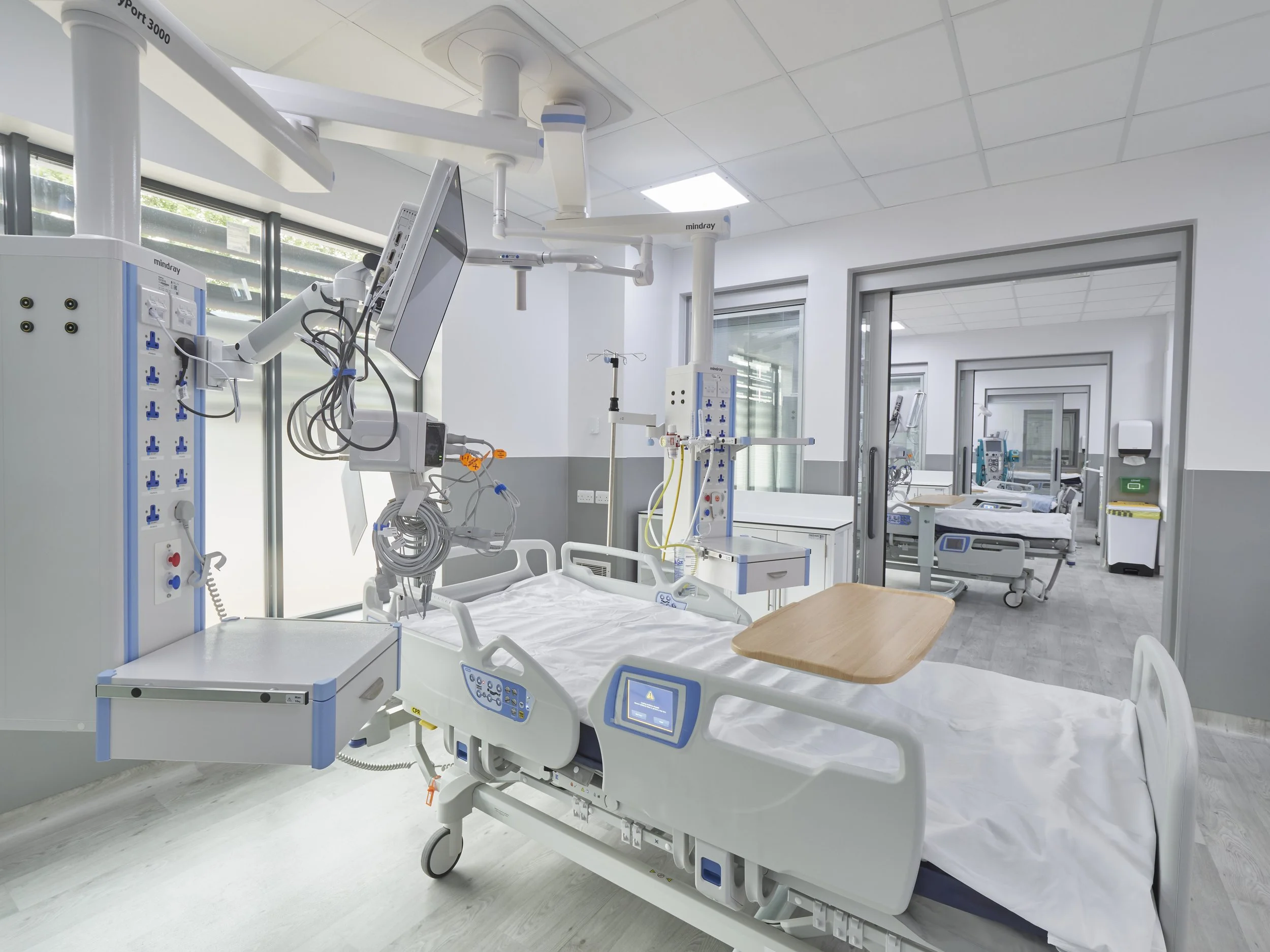
White has a long relationship with healthcare. During the nineteenth and twentieth centuries, it became increasingly associated with sanitation, hygiene and modern medical practice. In British hospitals, white remained an important symbol of cleanliness even as designers began introducing wider colour palettes.
There were practical reasons for this. Light-coloured surfaces could make dirt and damage easier to see, while simple finishes supported consistency and maintenance. Modern clinical environments still require surfaces that are durable, non-porous, resistant to fluids and capable of withstanding regular cleaning with detergents and disinfectants.
White itself is therefore not the problem.
It can create brightness, provide a neutral background and help spaces feel clean and ordered. In clinical rooms, it can also support accurate observation when coordinated with appropriate lighting and finishes.
The difficulty comes when white is expected to do everything.
An entirely white environment does not automatically feel reassuring, nor does it automatically provide good visibility or orientation. White doors against white walls, pale furniture on pale floors and signs disappearing into an equally light background can make a building harder to understand.
A space can be clinically compliant without feeling stark, impersonal or institutional.
Moving beyond simplistic colour psychology
Popular colour psychology often presents colour as a formula.
Blue is calming. Green is healing. Yellow is cheerful. Red is stimulating.
There may be some truth behind the associations people make with particular colours, but the evidence is far more nuanced than these simple statements suggest.
A major systematic review published in 2025 examined 132 peer-reviewed studies involving more than 42,000 participants across 64 countries. It found recurring associations between colours and emotions, but most were many-to-many rather than one colour producing one predictable response. Red, for example, was connected with both positive and negative high-arousal emotions. The researchers also found that lightness and saturation were important, not simply the name of the hue. Crucially, much of the research involved abstract colour associations rather than measuring how people actually felt inside real buildings.
Context matters.
A muted blue in a softly lit consultation room may feel very different from the same blue beneath harsh overhead lighting. A rich green may feel grounding when used with timber and natural daylight, but dark and oppressive when applied throughout a narrow internal corridor.
Age, visual ability, culture, personal experience and the activity taking place in the room can all influence how a colour is perceived.
That does not mean colour has no emotional value. It means designers should resist treating it as a prescription.
Colour and the emotional experience of care
People rarely enter a healthcare building as neutral observers.
They may be anxious about a diagnosis, worried about someone they love, experiencing pain or trying to take in unfamiliar information. Staff may be working under pressure while managing noise, interruptions and emotionally demanding situations.
Colour can help soften the institutional character of these environments. It can introduce warmth, familiarity and a sense of identity. But the emotional objective should be appropriate to the space rather than simply to make every room feel “calm.”
An outpatient consultation room may need to feel private and reassuring. An emergency department needs to be legible and easy to navigate, with minimal unnecessary visual complexity. A long-term treatment space may benefit from greater familiarity and domesticity. A clinical workstation needs clarity and alertness without becoming visually exhausting.
NHS design guidance recognises that therapeutic environments are created through the combined use of materials, colour, natural and artificial light, artwork, views and acoustic treatment. It also notes that more domestic-style finishes can help patients feel at ease and make necessary medical equipment feel less obtrusive.
There is some encouraging evidence for this wider approach. A quasi-experimental study of an evidence-based redesign in a Swedish emergency department found that patients and family members perceived the renovated environment’s light and colour as significantly more supportive than before the intervention. The improvements related to factors including orientation, safety, privacy, personal control and stimulation. However, because light and colour were changed as part of a broader redesign, the findings should not be interpreted as proof that a particular paint colour caused the improvement.
Similarly, a randomised study involving 80 orthopaedic patients reported better postoperative quality-of-life scores among those accommodated in rooms enhanced with colour and art compared with conventional rooms. Again, the intervention combined several environmental features, so it supports thoughtful interior design rather than providing a universal colour formula.
Colour as a wayfinding tool
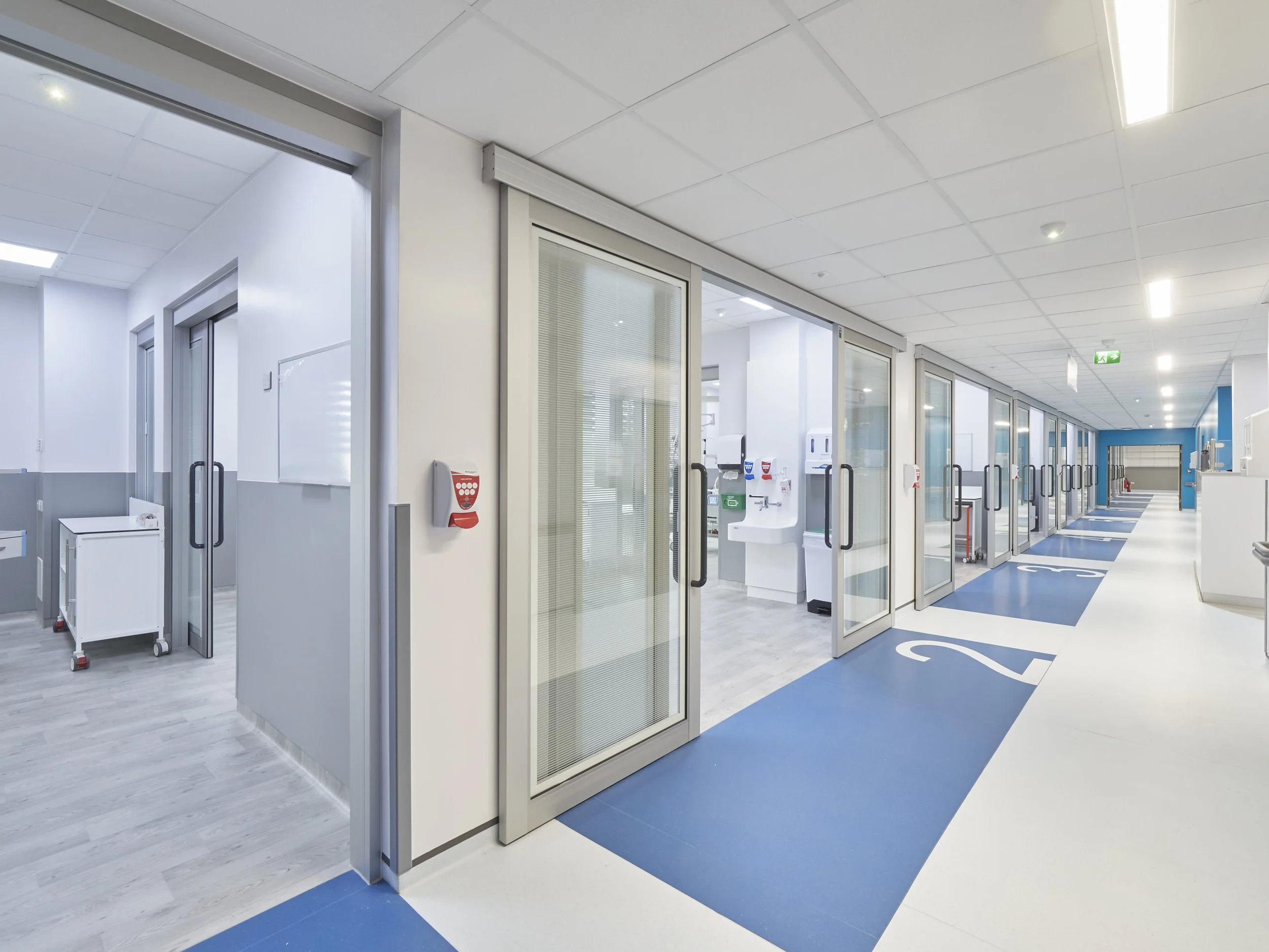
One of the most useful roles of colour in healthcare is not emotional at all. It is informational.
Colour can help identify:
Entrances and reception points
Different floors or geographical zones
Waiting areas and patient bays
Doors and important destinations
Staff-only or restricted areas
Changes between clinical and non-clinical spaces
However, colour should support wayfinding rather than replace it.
NHS wayfinding guidance is clear that signs alone cannot overcome an illogical layout. People use a combination of visible destinations, landmarks, architectural features, signs, maps, spoken directions and previous experience to find their way around a healthcare site. Colour coding is most effective when it is noticeable, consistently applied and integrated with these other sources of information.
A coloured wall behind a reception desk, for example, may make the point of arrival immediately recognisable. This is often more useful than scattering several unrelated accent colours across the entrance.
Likewise, a clearly defined colour or material at an important decision point can become a memorable landmark. Someone can understand an instruction such as “turn left at the green waiting area” more easily when that feature is distinct and consistently named.
By contrast, a corridor containing multiple colours with no obvious hierarchy may add visual interest but provide very little useful information.
NHS guidance also warns that healthcare sites should not rely entirely on colour coding. Colours used for navigation need to be easy to distinguish, applied prominently and repeated across signs, maps and architectural features. Similar shades or an excessive number of colours can make the system more difficult to understand.
Contrast, accessibility and inclusive design
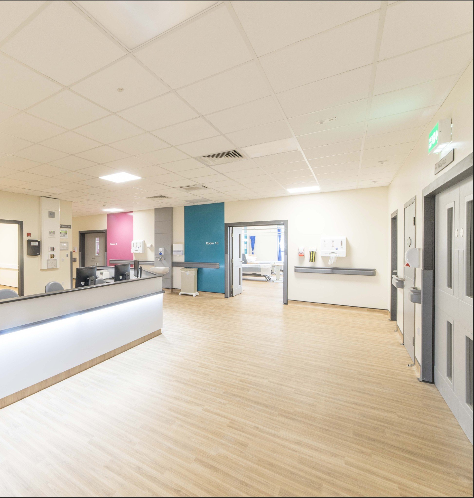
When discussing colour, the hue is often given more attention than the contrast between adjacent surfaces.
In practice, contrast may be far more important.
Consider whether people can clearly distinguish:
A door from the surrounding wall
A handrail from its background
A chair from the floor beneath it
A light switch from the wall
Sanitary fittings from surrounding surfaces
Ironmongery from the door face
Text from the background of a sign
NHS guidance notes that people with visual impairments may struggle to differentiate between colours of a similar tone. It therefore defines visual contrast using differences in light reflectance value, or LRV, rather than relying on colour names alone. It recommends avoiding monochromatic schemes and using contrast to identify features such as doors, stairs, lifts, switches and handrails.
This is particularly important in environments used by older people and people living with dementia. Colour and tonal contrast can help make essential destinations, furniture and fittings easier to recognise. Familiar forms and clearly distinguishable sanitary fittings can also support independence and dignity.
The intention should be deliberate. Features that people need to find can be emphasised, while doors leading to restricted or unsafe areas can be visually quieter.
Colour must never be the only way information is communicated. Words, symbols, numbering, tactile information, lighting, landmarks and logical planning should work together. A person who cannot perceive a particular colour difference must still be able to understand the building.
Different spaces need different approaches
Entrances and reception areas
The entrance establishes the first impression of the building. It should help people understand that they have arrived in the correct place and show them where to go next.
Colour can brighten an entrance and make reception, waiting areas or key routes easier to recognise. NHS guidance recommends a welcoming, light and natural character while warning that excessive colour can compete with important signs.
A strong backdrop to the reception desk, repeated carefully within signage or furniture, may provide all the colour that is needed.
Waiting areas
Waiting can be one of the most emotionally difficult parts of a healthcare journey. People may be worried, uncomfortable or unsure how long they will be there.
A restrained palette, natural references, artwork and carefully selected accents can make a waiting area feel less anonymous. Smaller zones can be given their own identity without creating an overstimulating environment.
The aim should not be to disguise the fact that someone is in a healthcare building. It should be to make the experience feel considered, dignified and human.
Consultation and treatment rooms
Consultation rooms need to support both conversation and clinical work.
Colour can help reduce the starkness of the room, but it should not distract from communication or interfere with examination and observation. The background behind a patient, the positioning of artwork and the relationship between wall colour, task lighting and clinical equipment should all be considered.
NHS guidance describes consultation rooms as technical spaces that should still place as much emphasis on helping patients feel at ease as on clinical efficiency. It recommends coordinating colour with natural light, artificial light, materials, acoustics and views.
Children’s healthcare
Children’s spaces do not need to be covered in bright primary colours to feel welcoming.
Colour, texture, themes and artwork can provide familiarity, playfulness and positive distraction, particularly during procedures or long waits. NHS guidance for children’s healthcare describes the skilful use of selected colour and texture as important, alongside lighting, artwork and the careful integration or concealment of intimidating equipment.
However, children have different ages, personalities and sensory needs. A palette designed only for very young children may feel inappropriate to teenagers, while a highly stimulating environment may be difficult for children with sensory processing differences.
A more thoughtful approach offers variety, quieter areas and opportunities for individual choice rather than assuming that more colour is always better. NHS sensory guidance similarly emphasises predictable environments and the need to reduce sensory overload for people who may be particularly sensitive to light, sound, texture or visual stimulation.
Dementia and older-person environments
In these settings, clarity, familiarity and recognition should take priority over fashionable colour combinations.
Important doors, bathrooms, handrails and furniture may need clear tonal contrast. Repeated or confusing patterns should be avoided, and the relationship between lighting and surface finishes needs particular care.
The objective is to help the environment explain itself.
A person should be able to recognise where to sit, how to find the bathroom and which door leads to their room without having to interpret a complex design concept.
Staff spaces
Staff rest areas should feel meaningfully different from the clinical environment.
That does not mean turning them into luxury lounges or filling them with impractical finishes. It means using a distinct palette, warmer lighting, comfortable materials and appropriate visual separation to signal a change of pace.
Even a brief break may feel more restorative when staff are not surrounded by the same colours, equipment and visual language as the clinical area they have just left.
Colour cannot be separated from light
Colour is a response to light. It does not remain fixed throughout the day or under different light sources.
A sample viewed beside a window on a bright morning may look completely different beneath artificial lighting in an internal treatment room. Surface sheen, shadows, adjacent materials and reflected colour can all change the way it is perceived.
This is why selecting healthcare finishes from a small sample in an office is rarely enough.
Colours should be reviewed:
In the intended room
Under natural and artificial light
At different times of day
Beside the proposed flooring, joinery and furniture
On a sufficiently large sample
With clinical equipment and signage where possible
Matt, semi-matt and gloss finishes can make the same colour behave very differently. Glare and reflection may also make surfaces harder to interpret, particularly for people with impaired vision or dementia. NHS circulation guidance therefore recommends minimising light reflection and considering lighting and colour together when defining walls, floors, doors and furniture.
Practicality still matters
A healthcare palette must continue to work after the photographs have been taken and the building is in daily use.
Finishes need to withstand cleaning, impacts, trolleys, equipment and repeated contact. Products may need replacing several years after installation, so availability and consistency matter. Very strong colours may show scuffs and repairs more readily, while an unusual bespoke finish may become difficult or expensive to source later.
Clinical wall finishes are expected to be durable, washable and resistant to detergents and disinfectants. Doors, work surfaces and furnishings must also be selected around infection prevention and cleaning requirements.
For larger healthcare organisations, a successful palette also needs to consider the wider estate. There may be value in creating a recognisable identity, but standardisation should not result in every department feeling identical.
The most resilient schemes usually establish a flexible family of colours and materials rather than relying on one fashionable shade. This allows individual departments to have their own character while replacement, maintenance and future alterations remain manageable.
A thoughtful approach, not a formula
There is no universal healthcare colour palette.
The right approach begins by understanding:
Who will use the space? What might they be feeling? What activities will take place there? What information must the environment communicate? Which features need to be noticed, and which should recede? How will daylight, artificial lighting and materials affect the colours? What clinical, maintenance and infection-control requirements must be met?
Colour can help a healthcare building feel warmer, clearer and more human. It can support identity, orientation, accessibility and dignity.
But it is most successful when it is part of a coordinated design response rather than a decorative decision made at the end.
The best healthcare colour schemes are not necessarily the ones people notice first. They are the ones that quietly help people know where to go, understand what to do and feel that the building has been designed with them in mind.
At ArchNest, I believe healthcare design should begin with people rather than trends. Colour is one of the tools available to us, but it is how thoughtfully we use it that makes the difference.
Research and further reading
NHS England, Health Building Note 00-01: General design guidance for healthcare buildings. General guidance on therapeutic environments, entrances, consultation rooms, materials, light, colour and internal wayfinding.
NHS England, Wayfinding: Effective Wayfinding and Signing Systems Guidance for Healthcare Facilities. Guidance on colour coding, signs, landmarks, entrances and coordinated wayfinding systems.
NHS England, Health Building Note 00-04: Circulation and Communication Spaces. Technical guidance on colour contrast, light reflectance values, floors, walls, doors and handrails.
NHS England, Health Building Note 08-02: Dementia-friendly Health and Social Care Environments. Design principles for supporting recognition, independence, orientation and dignity for people living with dementia.
Jonauskaite, D. and Mohr, C., “Do We Feel Colours? A Systematic Review of 128 Years of Psychological Research Linking Colours and Emotions.” A review of 132 studies examining the complexity of colour-emotion associations.
Lindahl, J. et al., “The Perceived Support From Light and Color Before and After an Evidence-Based Design Intervention in an Emergency Department Environment.” A quasi-experimental study of patient and family perceptions following an emergency-department redesign.
Eminovic, S. et al., “Positive Effect of Colors and Art in Patient Rooms on Patient Recovery After Total Hip or Knee Arthroplasty.” A randomised controlled study comparing conventional rooms with rooms enhanced through colour and artwork.